In this level you will learn:
How to use The Energy Map
What is EUI and How to Interpret it
The Energy Map
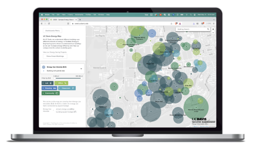
We built the Campus Energy Education Dashboard so you can see how much energy your building is using. Before you head over to check it out, we'll explain how you can interpret what you'll see.

In this video, Josh explains how we use Energy Use Intensity (EUI) on our dashboard.
- EUI is a standard energy metric, calculated by dividing a building’s annual energy use (in kBtu) by its square footage.
- EUI is a great metric to compare how buildings are using energy because it is energy use per square foot. This levels the playing field, so to speak.
- So you can't say a building has a larger EUI (and a bigger circle on the map) because it's a bigger building.
How to Interpret an EUI
Energy Use Intensities (EUI) can be high or low, but what does the number mean?
- The numeric value of an EUI can be used to see if a building is performing efficiently or not.
01. Compare to Other Buildings
One way to use a building’s EUI is to compare it to the average EUI for that building type. By doing this you can see if a building is performing better than average.

02. Compare to Past Energy Use
A second way to use the EUI metric is by looking at one building’s EUI over several years. If the EUI getting lower over time it’s a good sign, perhaps a sign that a recent energy efficiency project is saving energy in the building.

03. Compare to Benchmark
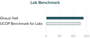
Lastly, EUIs can be compared to target EUIs to determine if a building is on track to meeting a target or goal.
- The University of California Office of the President (UCOP) developed target EUIs for all UC campuses, including UC Davis. We have targets for laboratory buildings, non-laboratory buildings and housing buildings.
- They get more stringent each year, pushing us to build more energy efficient buildings on campus.

Your Determination Lights The Way!
Level 4 Conquered

